It is possible to efficiently show designs and contents using typography.
An integrated typography environment can be defined using the Malgun Gothic type which is the default font provided by PPT.
Typeface

Type scale
In general, the type for text is a size smaller than 14 points and the type for titles is a size larger than 14 points.
These types are used considering thickness, the space between letters, the space between lines, etc. to serve each purpose.
These types are used considering thickness, the space between letters, the space between lines, etc. to serve each purpose.
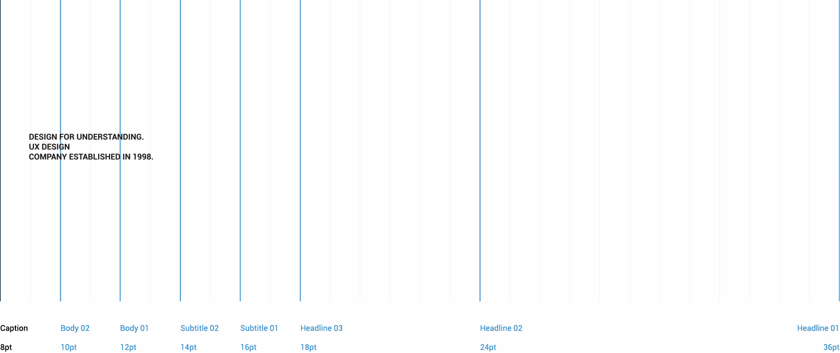

This example-type scale makes an integrated typography environment using the clear Gothic typeface for all headlines, the text, and captions.
Layers are conveyed through the font weight (light, medium, bold), size, and differences in letter and line spaces.
The examples used for tables were written based on the Roboto typeface. The clear Gothic typeface standards and applicable values used for PPT are compatible.
Letter spacing and Leading
Regarding larger letters like headlines, it is important to reduce the space between letters and to make the space between words wider than
that between lines in order to improve the reading convenience. In the case of letters of smaller size, the readability can be improved through increasing
the space between letters. It is necessary to adjust the space between rows to be not too wide or too narrow.
that between lines in order to improve the reading convenience. In the case of letters of smaller size, the readability can be improved through increasing
the space between letters. It is necessary to adjust the space between rows to be not too wide or too narrow.

Headlines which are the biggest text on the screen are reserved as the short and important part of the text or numbers.
Subtitles are smaller than headlines. They, in general, are reserved for the short text part to be emphasized in the medium degree.

The text is provided in the range of 10~12 points, which is generally used for writing long-form texts.

Captions are the smallest font size, and they usually are used for annotating images or introducing headlines.
Line length
The moderate line width makes people focus on the writing and feel comfortable. The line length of the text, in general, is between 40~60 letters.
For writing lines with larger width, the height of line space should be increased based on the maximum 90 letters.
For writing lines with larger width, the height of line space should be increased based on the maximum 90 letters.

Paragraph
The alignment controls how the text is aligned in the space where it is shown. The text aligned from left to right is the most common setting to improve readability and composition.

Visual alignment of paragraphs
The visual alignment of paragraphs can reduce inconvenience and confusion pertaining to documents.
Punctuation marks in PPT documents need to be visually aligned in title types.
Punctuation marks, such as quotation marks, make the first line look short, so they always should be hung outside of the text.
It is necessary to avoid a single character left at the end of a paragraph even by adjusting the content of the previous part of the text.
The dash (-) which is the connecting symbol should be used carefully regarding spacing depending on the purpose, because it has two notations.

Typeface & Relationship
As the criterion for distinguishing the types for titles and the types for the text, it is important to maintain one or more lines. The height of lines of the text types should be applied in proportion to the size.
